
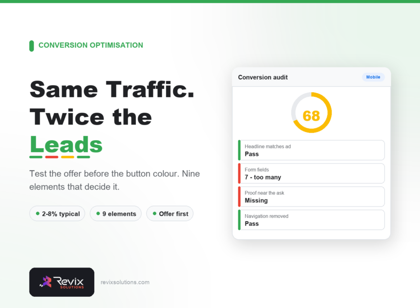
Landing page conversion rate optimization is the cheapest growth available to most businesses — doubling a 2% conversion rate to 4% has the same effect as doubling your ad budget, without the cost. Yet most teams start by testing button colours. This guide covers realistic benchmarks, the page structure that converts, what to test in what order, and the mistakes that quietly lose leads. Serious landing page conversion rate optimization begins with the offer, not the button.
Landing page conversion rate optimization: the short answer
Conversion rate is determined mostly by your offer, then your message, then your mechanics — in that order. A landing page converts when the headline matches what the visitor clicked, the value is obvious within five seconds, the proof is credible, and the form asks for as little as possible. Test the offer first. Button colour is real but trivial by comparison.
What counts as a good conversion rate?
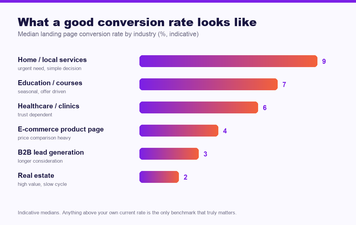
Benchmarks are frequently misused. A 3% B2B conversion rate might be excellent; a 3% rate on a local emergency service is poor. Use these as orientation, then compete against your own baseline.
| Industry | Typical range | What drives the difference |
|---|---|---|
| Home / local services | 6–12% | Urgency, simple decision |
| Education / courses | 4–10% | Offer strength, season |
| Healthcare / clinics | 4–9% | Trust signals, ease of booking |
| E-commerce | 2–5% | Price, shipping clarity |
| B2B lead generation | 2–5% | Form length, offer relevance |
| Real estate | 1–3% | Purchase size, long cycle |
The structure that converts
There is no magic layout, but high-performing landing pages consistently contain the same nine elements in roughly this order.
- A headline that matches the ad. If the ad said “Free site survey,” the headline says “Free site survey.” Mismatch here causes more lost conversions than any other single factor.
- A subheadline stating who it is for. One sentence of qualification saves everyone time.
- A single clear call to action, visible without scrolling.
- Proof placed immediately after the promise. Reviews, client names, numbers, certifications.
- Three benefits, not ten features. Written from the customer’s position.
- A visual showing the actual thing. Real photography of your work outperforms abstract illustration.
- Objection handling. Cost, timeline and “what happens next” answered before they are asked.
- A short form. Every field removed measurably increases completion.
- A repeated call to action at the end for people who read everything.
Remove the navigation
A landing page has one job. Site navigation offers a dozen ways to leave. Removing it is one of the few near-universal improvements in conversion optimisation.
Start with the offer, not the page
Most conversion problems are offer problems wearing a design costume. If your call to action is “Contact us,” you are asking for effort and promising nothing.
Strong offers share three traits: they are specific (“free 20-minute audit of your Google Business Profile”), they reverse risk (“no obligation, no card required”), and they arrive quickly (“results within two working days”). Compare that with “Get in touch to learn more” — same page, entirely different conversion rate.
Forms: ask for less
| Fields | Relative completion | When to use |
|---|---|---|
| 1–2 (name, phone) | Highest | High-volume local services |
| 3–4 | Good balance | Most service businesses |
| 5–7 | Noticeably lower | B2B where qualification matters |
| 8+ | Steep drop-off | Rarely justified |
A useful test: for each field, ask whether you would still contact the person if it were blank. If yes, remove it. Job title, company size and “how did you hear about us” are the usual offenders.
What to test, in what order
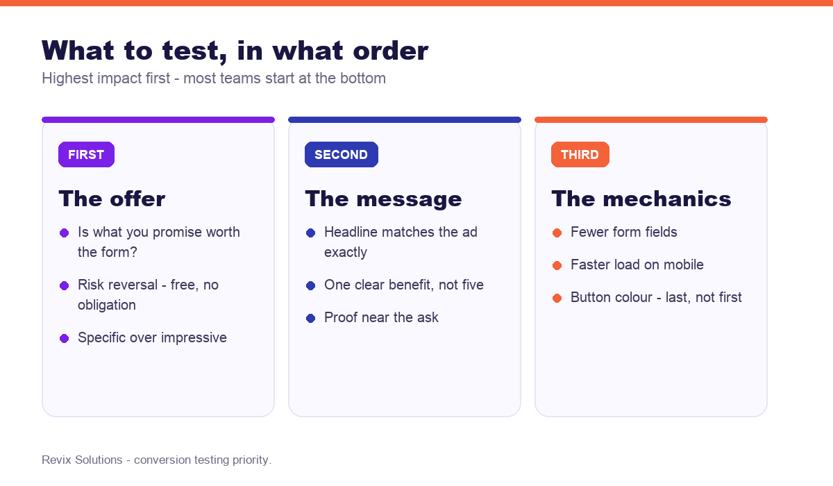
Test in descending order of impact. Within each level, change one variable at a time so you can attribute the result.
On statistical honesty: a test needs roughly 100 conversions per variant before the result means much. Below that you are reading noise. If your traffic cannot produce that within a month, do not run an A/B test — make the obviously better change and move on.
Speed is a conversion factor
Mobile users abandon slow pages, and most Indian traffic is mobile. Practical priorities: compress and correctly size images, avoid loading heavy sliders above the fold, defer non-essential scripts, and test on a mid-range phone on mobile data rather than office wifi.
Mistakes that quietly cost leads
- Sending ad traffic to the homepage. The most common and most expensive mistake.
- A carousel above the fold. Visitors rarely see slide two, and it delays load.
- Vague calls to action. “Submit” asks for effort; “Get my free audit” describes a benefit.
- Proof at the bottom only. Trust is needed at the moment of asking, not after.
- No mobile testing. Forms that work on desktop routinely break on phones.
- No thank-you page. You lose both conversion tracking and the chance to set expectations.
- Slow follow-up. A converted lead contacted three days later is barely a lead.
Measuring properly
Track conversion rate by traffic source, not just overall — paid, organic and social visitors behave differently, and a blended number hides both problems and wins. Also track what happens after the form: if leads convert to customers at very different rates by source, optimise for the source that produces customers, not the one that produces forms.
Frequently asked questions
What is a good landing page conversion rate?
In practice, landing page conversion rate optimization follows the same rules for most businesses. Most landing pages convert between 2% and 8%. Local service pages often reach 6% to 12% because intent is high, while real estate and high-value B2B typically sit between 1% and 3%. Your own previous rate is the most useful benchmark.
How many form fields should a landing page have?
Three to four fields suits most service businesses. One or two maximises volume for high-intent local services, while five or more is justified only when qualification genuinely saves sales time.
Should landing pages have navigation menus?
No. Removing site navigation from a dedicated landing page consistently improves conversion, because every navigation link is an alternative to converting.
How much traffic do I need to A/B test?
Roughly 100 conversions per variant before results are reliable. If your traffic cannot deliver that within about a month, make the clearly better change directly instead of running a formal test.
What should I test first on a landing page?
The offer, then the headline, then the form length. Visual details such as button colour produce the smallest gains and should be tested last, not first.
Does page speed affect conversion rate?
Yes, particularly on mobile. Slow-loading pages lose visitors before they see the offer, and speed also affects Google Ads Quality Score, so it influences both conversion rate and cost per click.
If you would rather have landing page conversion rate optimization handled for you, our website development services and website optimisation cover exactly the work described above.
Because of that, landing page conversion rate optimization rewards consistency far more than intensity.
Landing page conversion rate optimization: what to do next
The short version of this guide: landing page conversion rate optimization rewards sequence over effort. Fix the foundations first, publish what your customers actually search for, then measure enquiries rather than rankings. Businesses that treat landing page conversion rate optimization as a system rather than a checklist are the ones still compounding a year later.
Getting traffic but not enough leads?
We will review your landing pages against the nine conversion elements, identify where visitors drop off, and give you a prioritised list of changes ranked by expected impact.
Get your free conversion review
See current pricing or browse recent work.
Related reading: The perfect SEO title tag formula and a startup’s guide to content marketing.