

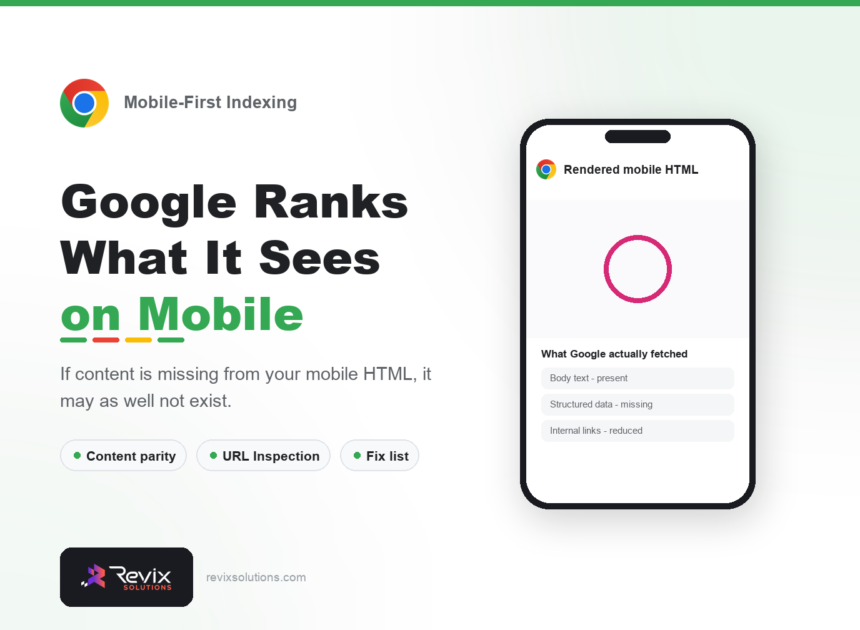
Mobile-first indexing means Google predominantly uses the mobile version of a page to decide how it is indexed and ranked.
Mobile-first indexing is the subject of this guide, so here is the short version first. Google indexes and ranks your site based on its mobile version. If content exists on desktop but not on mobile, for ranking purposes it may as well not exist. This catches out sites that deliberately simplified their mobile experience — a decision that once improved usability and now quietly removes content from the index. This guide covers what to check and what to fix. This mobile-first indexing guide covers what Google actually fetches, and what quietly goes missing.
Mobile-first indexing: the short answer
Google predominantly uses the mobile version of your page for indexing and ranking. The critical rule is content parity: everything on desktop – body text, headings, images with alt text, internal links and structured data – must also exist in the mobile HTML. Use the URL Inspection tool in Search Console to see exactly what Google fetched, and compare it against your desktop page.
What mobile-first indexing actually means
It does not mean mobile pages rank better, and it does not mean desktop no longer matters to users. It means that when Google crawls, indexes and evaluates your page, it uses the mobile version as the primary source of truth.
For a responsive site serving identical HTML to all devices, this changes almost nothing — which is why responsive design is the recommended approach. Problems arise where the mobile experience differs from desktop in what content it actually contains.
Content parity is the whole issue
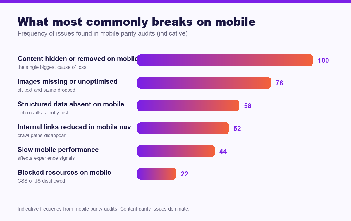
The most damaging pattern is well-intentioned: a team simplifies the mobile page to reduce clutter, removing supporting paragraphs, an FAQ section or a comparison table. Desktop visitors still see a thorough page. Google sees the reduced one, and ranks it accordingly.
| Element | Must appear on mobile? | Why |
|---|---|---|
| Body text | Yes, in full | Removed text is not indexed |
| Headings | Yes, same hierarchy | Headings define structure and extraction |
| Images | Yes, with same alt text | Missing alt text loses image search visibility |
| Internal links | Yes | Crawl paths and authority flow depend on them |
| Structured data | Yes, identical | Rich results are lost silently otherwise |
| Meta tags | Yes | Titles and descriptions must match |
Tabs and accordions
Content inside tabs and accordions is generally indexed, provided it is present in the HTML rather than loaded on click. It is a reasonable pattern for mobile usability. The caveat worth knowing: content requiring interaction to appear is less likely to be extracted for AI answers and featured snippets, so keep your most important passages visible by default.
How to check your own site
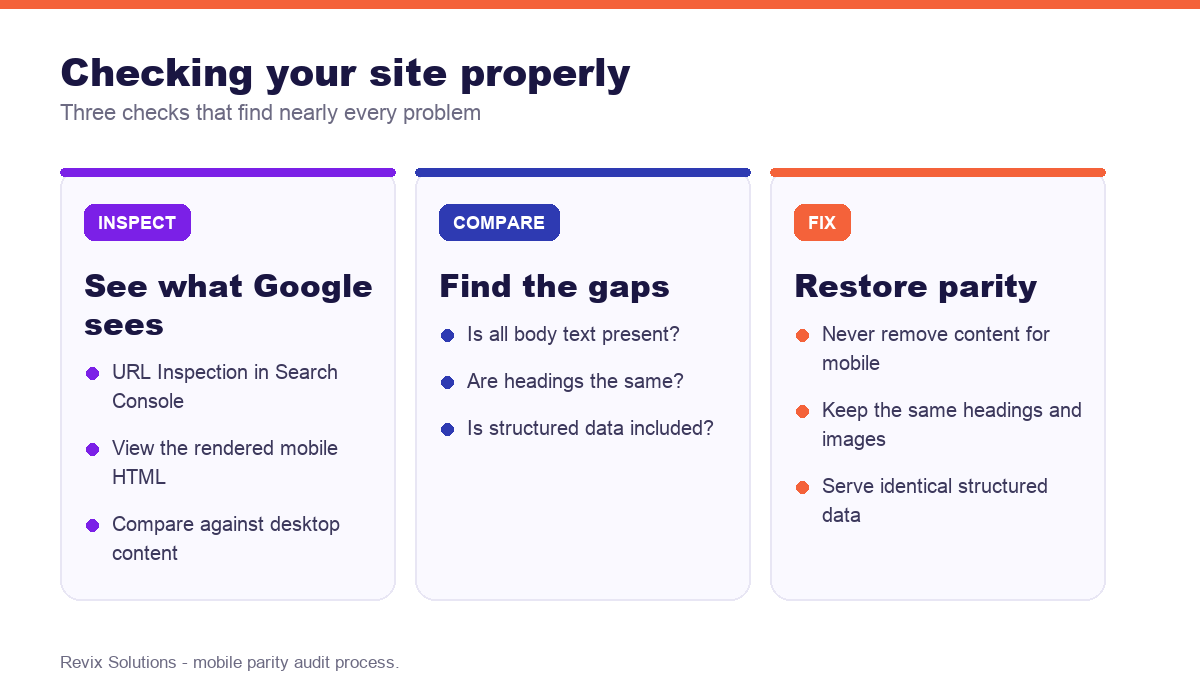
The URL Inspection tool in Search Console is the authoritative check. Enter a URL, run a live test, and view the rendered HTML — that is what Google actually fetched from your mobile page.
Then compare. Copy the visible text from your desktop page and from the mobile rendered HTML, and look for anything present in one and absent in the other. Do this for your five most important pages; problems are usually systematic, so if one page has a gap, the template does.
A quicker informal check: open the page on a phone and read it end to end. If something you expected is missing, that is your answer.
What to fix, in order
- Restore any content removed from mobile. Use a collapsible section rather than deleting if space is the concern.
- Match headings exactly across both versions, including the H1.
- Serve the same structured data in the mobile HTML.
- Keep internal links. Collapsing navigation into a hamburger menu is fine; removing links from the page body is not.
- Ensure images load with alt text and that lazy loading does not prevent indexing.
- Do not block CSS or JavaScript in robots.txt, since Google needs them to render the page as a user would.
Speed is related but separate
Mobile performance affects rankings through Core Web Vitals as part of page experience signals, but this is distinct from indexing. A slow mobile page is still indexed; a mobile page missing content is not fully indexed regardless of how fast it loads. Fix parity first, then performance.
If you still run a separate mobile site
Separate m-dot URLs are now rare and carry avoidable risk: content drift between versions, canonical and annotation errors, and duplicated maintenance. If you still operate one, migrating to responsive design is almost always the right long-term decision, planned carefully with redirects in place.
Frequently asked questions
What is mobile-first indexing?
In practice, mobile first indexing follows the same rules for most businesses. Mobile-first indexing means Google predominantly uses the mobile version of your page for indexing and ranking. If content exists on desktop but not mobile, Google may not see it at all.
Does my site need to be responsive?
Effectively yes. Responsive design serves the same HTML to all devices, which avoids content mismatches between versions and is the approach Google recommends.
What content problems does mobile-first indexing cause?
The main one is hiding content on mobile. If you remove text, headings, images or structured data from the mobile view, that content may not be indexed even though desktop users can see it.
Is content in tabs and accordions indexed?
Content in tabs and accordions is generally indexed if it exists in the HTML. However, content loaded only after a user interaction may not be, and it is less likely to be extracted for AI answers.
How do I test my site for mobile-first indexing?
Use the URL Inspection tool in Search Console to see the rendered mobile HTML Google fetched, and compare it against your desktop content for anything missing.
Does mobile page speed affect rankings?
Yes, through Core Web Vitals as part of page experience signals. The effect on rankings is modest, but the effect on conversion is substantial since most traffic is mobile.
If you would rather have mobile first indexing handled for you, our website optimisation and technical SEO services cover exactly the work described above.
Every one of these mistakes is avoidable, and together they explain most of the gap between businesses that get results from mobile first indexing and those that do not.
Because of that, mobile-first indexing rewards consistency far more than intensity.
However, mobile-first indexing only compounds when the basics stay in place month after month.
In practice, most businesses underestimate how long mobile-first indexing takes to show results.
As a result, mobile-first indexing works best when it is measured against enquiries rather than rankings.
That said, mobile-first indexing is not a one-off project, and treating it as one is the usual mistake.
Mobile first indexing: what to do next
The short version of this guide: mobile first indexing rewards sequence over effort. Fix the foundations first, publish what your customers actually search for, then measure enquiries rather than rankings. Businesses that treat mobile first indexing as a system rather than a checklist are the ones still compounding a year later.
Rankings dropped without an obvious cause?
We will compare what Google fetches from your mobile pages against your desktop content, identify any missing text, links or structured data, and give you a prioritised fix list.
Get your free mobile parity audit
Plans start from Rs 16,000 per month. See current pricing.
Related reading: Core Web Vitals optimization guide, Google Search Console guide for beginners.